Defining the Model
The title seems to imply there is one model for the Mauna Loa CO2 data series. But there are many, some of which may be better than others in describing the data and some better also in revealing the underlying processes that generate the observations. So “defining the model” actually refers to a process of exploration.
What happened to the naïve approach? Rather than proceed as if I knew nothing about the data, I intend to explore the data series without committing to hypotheses about what physical, biological or social factors generated the data.
Properties of the Mauna Loa CO2 Series
The approach to modeling will depend on whether the modeler is working with the daily, weekly, monthly or annual data. As of 20th May 2015, the were 2139 weeks of data from May 19, 1974 to May 10, 2015. For most years there were 52 weeks, but for 7 years there were 53 weeks.
As of now, we have 52 weeks for 41 years, which is 2132 weeks. Plus for 7 of those 41 years we have one extra week, for a total of 2139 observations.
We begin by reading the data as a vector into a spreadsheet, estimate the missing values and then prepare a graph to view the full years from the first week in 1975 to the last week in 2014.
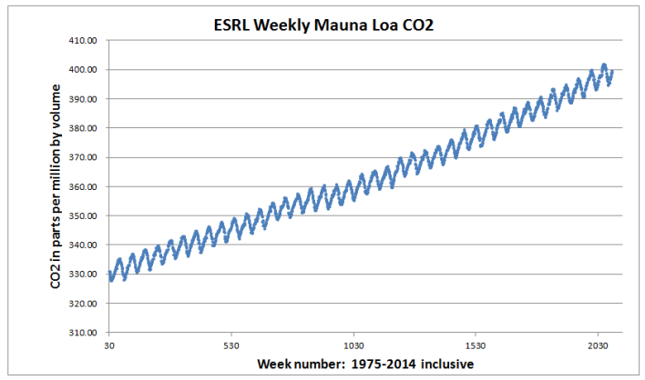
My first impressions are: the annual variations are wave-like and the long-term pattern seems to increase almost as a straight line, with very small fluctuations from year to year.
I count as a discovery that the waves appear to be equally spaced and similar in amplitude. This is something to keep in mind for next steps.
We can see the pattern of CO2 growth and variability is different from a random walk as described by the Penn State Department of Meteorology in the following graphic.
With a random walk, the mean and variance are not constant over time. Such a process, if subject to shocks, does not revert to the mean of its path. The process is not stationary and unless it can be transformed into a stationary process, statistical tools will give spurious results.
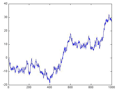
By contrast, the process that generates the CO2 data does revert to a mean, but it is the mean value of the long-term trend line. The series is not stationary but it is mean-reverting. As a consequence, the series can be transformed so that statistical tools give valid results. The problem is to find a method to transform the data.
Close-up Visualization
A closer look at the CO2 data reveals details of short-term patterns and noise (random variations).
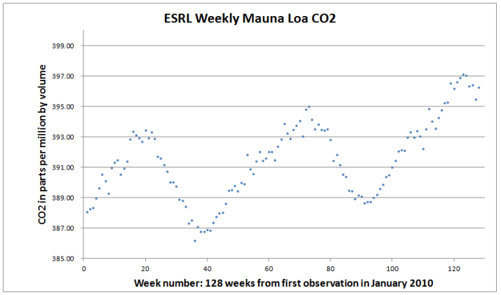
In this segment of the series there are three peaks and two troughs. It appears that the three peaks could be connected by a straight line.
I count the apparent pattern in peaks as a discovery to be kept in mind.
The seasonal variation seems to follow a saw-tooth pattern, which may or may not result from the upward trend.
I count as a discovery that the wave pattern might be saw-tooth .
Seasonal Pattern: Saw-tooth or Sinusoidal?
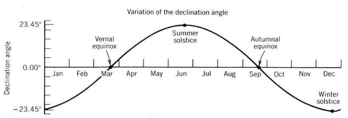
By asking this question, I am taking the first step into geophysical theory, but it is a small departure from the naïve approach because it is common knowledge that the Earth has seasons and that the changing of the seasons is related to the Sun as demonstrated by the following graphic from Robert O’Connell course in Astronomy.
I cannot be certain, but I can proceed by using the working hypothesis: the seasonal pattern of the Mauna Loa CO2 series is generated as a sinusoidal series. I reserve judgement on the reason for the saw-toothed appearance.
Caveat: I count as a risk that assuming a sinusoid pattern may bias my results.
Consequences of Sinusoidal Pattern in the Data
The main consequence of assuming the seasonal pattern to be sinusoidal is that statistical software has the facility for using sine and cosine functions to transform data.
Yet, before proceeding to modeling using trigonometric functions, there is a simple way to explore the data. The following figure shows a complete sine function (A1 and B1) and we know that the full cycle covers 360 degrees, equivalent to one revolution of Earth around the Sun.
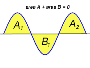
We know that area A1 + area B1 = 0 because A1 has positive values and B1 has equal and opposite (negative) values. Also we know that moving from right to left by 180 degrees subtracts A1 and adds exactly the same amount at A2.
Intuitively we can see that if we always sum over 360 degrees, then moving one degree from left to right will subtract from A1 exactly the same amount as added at A2.
We conclude that a moving average of 360 degrees (one year) along the entire waveform will always equal zero.
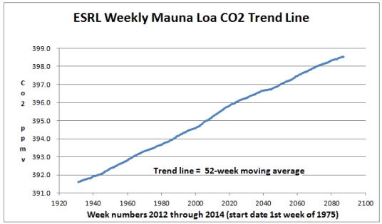
However if we apply a moving average of 52 weeks from 1975 to 2014 the total will not equal zero. If the peaks and the troughs are equally high and low, the sum of weeks 1 to 52 and the sum of weeks 2 to 53 and so on will give the average of the peaks and troughs. This will be an estimate of the tend in CO2 increase from week to week with seasonality removed. The result will be a line that represents the trend in CO2 level.
We cannot proceed to the end of the series because when we pass the first week in 2015 would have only 51 weeks in our sum. We will lose 51 weeks of our series: at the beginning or end, or 25 and 26 weeks at each end. (I ignore the data from part years, 1974 and 2015.)
There are other risks in using this approach. This is the real world that is being measured and not a mathematical function. We cannot be sure that the points of time in the real world, equivalent to A and B, from May to September, are constant in width. Perhaps the time between maximum and minimum varies by a week or so from year to year.
Nor can we be sure that the moving average fits the amplitude of seasonal variations in the real world, although the moving average is adaptive over time periods as long as 52 weeks, over shorter time periods the moving average could generate artifacts.
I have to keep in mind that this analysis will give approximations for exploration only. The fluctuations and anomalies in the data series are so slight that these rough approximations may lead to false conclusions.
The following graphic shows the trend line for years 2012 through 2014. The 53rd weekly data value for 2012 was omitted. This avoided misalignment of the series. By omitting the 53rd week, the date of the vernal equinox (March 20th or 21st) remains almost aligned at about the 12th week.
Precise alignment on the dates of the vernal equinoxes to a precision of +/3 days will be done during pre-processing. The autumn equinoxes are not expected to become aligned. This may be justified on both geophysical and biophysical grounds. Physics alone tells us that solar energy increase at the vernal equinox drives the annual cycle. Thus solar energy decline at the autumnal equinox may allow the system to return to its state at the vernal equinox (relaxation).
In physical terms, this view of the system would would be equivalent to a variably damped harmonic oscillator with variable periodic perturbation. This seems a long way from the naïve approach, but these ideas are simply working hypotheses and not commitments.
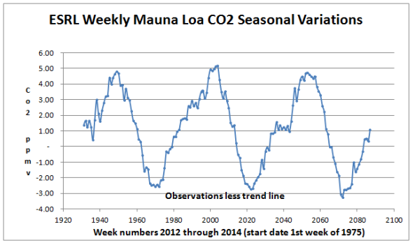
The trend line can be superimposed on the data series. Note that the trend line is equivalent to the zero line in the seasonal graph.
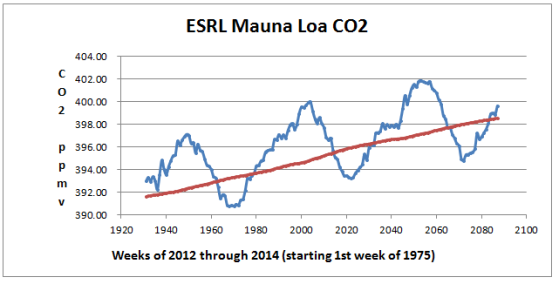
The seasonal graphic does not look quite right because the series seems to be declining when the expectation was that it would be neither increasing nor declining. Further, when the trend line is superimposed on the original data, it does not appear to be centered vertically, but instead appears to pass through a little below the midpoint between the maximum and minimum values. This visual impression arises mainly because the last year peak and trough are both lower than the preceding two years.
However, the following graphic demonstrates alternative ways of conceptualizing the relationship between seasonal variations and the trend line.
I am using the term “outgassing” to refer to the release of CO2 into the atmosphere from all sources, including combustion and respiration, and the term “drawdown” to refer to the capture of CO2 from the atmosphere by all sinks.
Some sources may also be sinks and vice versa, depending on the season and state of Earth systems.
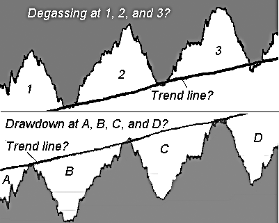
To explore the data, I assumed that the process of drawdown in summer is balanced by the process of degassing (including combustion) and that therefore the trendline should pass through the mean between the peaks and troughs. I therefore imposed on the data a trendline that fits this hypothesis.
Yet, the data series itself has two intrinsic trend lines defined by the annual maximum and minimum levels of CO2 in May and September respectively. The gaps between adjacent minima and maxima could provide a measure of the varying width of the channel that contains the data series.
These three measures are non-parametric in the sense that no formal hypothesis needs to be posited concerning the shape of the annual cycle, whether sinusoidal or saw tooth. This may or may not be useful as a way to proceed but is prompted by an article by Graham Griffiths, City University, London, UK and William Schiesser, Lehigh University, USA in Scholarpedia.
About linear and non-linear waves they say:
The term amplification factor is used to represent the change in the magnitude of a solution over time. It can be calculated in either the time domain, by considering solution harmonics, or in the complex frequency domain by taking Fourier transforms.
Some dissipation and dispersion occur naturally in most physical systems described by PDEs. Errors in magnitude are termed dissipation and errors in phase are called dispersion. These terms are defined below. The term amplification factor is used to represent the change in the magnitude of a solution over time. It can be calculated in either the time domain, by considering solution harmonics, or in the complex frequency domain by taking Fourier transforms.
…Generally, [numerical dissipation] results in the higher frequency components being damped more than lower frequency components. The effect of dissipation therefore is that sharp gradients, discontinuities or shocks in the solution tend to be smeared out, thus losing resolution…
…the Fourier components of a wave can be considered to disperse relative to each other. It therefore follows that the effect of a dispersive scheme on a wave composed of different harmonics, will be to deform the wave as it propagates. However the energy contained within the wave is not lost and travels with the group velocity. Generally, this results in higher frequency components traveling at slower speeds than the lower frequency components. The effect of dispersion therefore is that often spurious oscillations or wiggles occur in solutions with sharp gradient, discontinuity or shock effects, usually with high frequency oscillations trailing the particular effect…
The naïve approach has led me to view the CO2 series as representing global phenomena that may be subject to amplification, dissipation and dispersion, not something amenable to analysis by spreadsheet.
The pattern of increase and decrease in CO2 may reveal three things: the net increase year by year (1), and the relative power of sources (2) compared to the sinks (3).
That the trend line passes through the series about midway between the annual peaks and troughs is a reasonable assumption. Even so, this assumption seems to me to be a theoretical construct for estimating the net power of the sources and sinks.
An alternative way to conceptualize the series is to focus on the peaks and the troughs. The annual increase above the bottoms of the troughs shows when the sources have more power than the sinks. The annual decline below the peaks shows when the sinks have more power than the sources.
Phenology is concerned with the timing of biotic activity and events. The amount of inter-annual variation in timing of the peaks, troughs and the time interval between the peaks and troughs, if any, seems to me to be worth investigating.
Conclusions
Manipulation of the data in a spreadsheet is useful for the exploratory stage of the study. In addition to the results reported here, I explored the following:
1. Mean annual CO2 level and its variance. I found that the variance increases with the mean but did not check to see if this was in accordance with Taylor’s power law. I did a rough check and found that the percentage increase in standard deviation scales with the percentage increase in the mean, which points to compound growth in CO2 level over time.
The apparent increase in variance about the trend lend appears to be an artifact of the using a linear model instead of an compound growth rate model.
The correlation between year number and annual average CO2 level for exponential trend seems not be significantly different from the exponential trend. Each regression accounted for over 99% of variance in the CO2 level. The arithmetic trend was slightly concave upwards and the exponential trend slightly concave downwards. The arithmetic increase in CO2 averaged 1.70 ppmv per year compared to the average seasonal amplitude of about 6.2 ppmv. The seasonal amplitude represented 1.7% of the average CO2 level of 362 ppmv.
2. I examined departures from the smooth trend line and found interesting anomalies. Since the methodology is crude, not a lot can be derived from this graph. The 1998 super El Niño left its mark. However, the role of the eruption at Pinatubo in June 1991 may have been exaggerated, since close inspection shows that the CO2 level was declining before the eruption occurred.
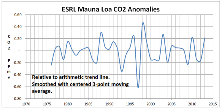
The most significant lesson from analysis of the anomalies is that the difference between the maximum and minimum anomaly was only 6 ppmv, about equal to the seasonal variation, reduced in this graphic by smoothing to about one ppmv.
CO2 is a trace atmospheric gas that increased on average by one-third of one percent per annum between 1959 and 2014. (The percentage growth rate is identical when calculated as linear or geometric.)
The global level of CO2 as measured at Mauna Loa fluctuates seasonally about the annual trend in a range of about 1.5%. (Geometric average of the range taken from peak to trough, range defined as the ratio of annual maximum divided by annual minimum.)
The annual trend line is subject to external shocks, such as El Niño, but is mean-reverting, so that anomalies from the long-term trend line are about the same order of magnitude as the seasonal variations.
All these characteristics of CO2 data cause statisticians to refer to the series as an example of a deterministic trend that is stationary about its trend line. “‘Deterministic” in science implies that some external (physical and/or social) processes generate the observations and that the scientific problem is to discover what these processes are and how much each “determines” the observed resultant level of CO2 in the atmosphere and its variation temporally and spatially.
Given the location and elevation of the Mauna Loa Observatory, the atmospheric gases may be well-mixed. If so, this would have the effect of a low-pass filter that allows the ENSO signal to remain but may or may not suppress teleconnections with other oceanic basins, the Atlantic and Indian Oceans in particular. By analogy, continental-scale signals from biotic, geologic and human factors may also be filtered out.
What remains appears to be a global CO2 signal representing net emissions (sources minus sinks). Because there is so little land and population in the Southern Hemisphere, land-based signals may be taken to represent a Northern Hemisphere signal.
Decision about how to Proceed
All of these consideration have led me to decide that analysis by spreadsheet is acceptable for inspection of the main characteristics of the data series, exploration, but not for much more than exploration.
What I will need to proceed are tools powerful enough to disentangle temporal, geographical, natural and human factors in CO2 levels and its variability.
At the very least it will be necessary to use trigonometrical functions to fit trendlines and Fourier analysis to detrended CO2 data series, not only the Mauna Loa series, but other series in the global network.
Years ago I converted Peter Bloomfield’s FORTRAN code for Fourier analysis into Microsoft QuickBasic, a programming package that is now obsolete. (Fourier Analysis of Time Series: An Introduction. Wiley, 1976.)
The second edition of Dr. Bloomfield’s book (published in 2000) uses the S-Plus language, a commercial version of S. There are some important differences between R and S, but much of the code for S runs unaltered in R.
A little research about R reveals why the language has become so popular with the scientific community. R is free and so are thousands of addons, packages, functions, code snippets and tutorials. And although R is and was specifically designed for statistical analysis, the language has evolved into a complete system for scientific research and presentation.
Up to this point, my analysis of Mauna Loa Co2 series has relied on spreadsheets. I had intended to infill missing data using the R programming language, but have decided it will be more efficient to do the pre-processing using Excel and the statistical analysis using R.
Part 4 to follow: Literature Review of the Mauna Loa CO2 Series


You must be logged in to post a comment.